Learn how to translate brand colors, patterns and artwork into custom commercial wallpaper, with a proof-to-delivery workflow for specifiers.
Custom wallpaper for brand identity turns a brand guideline into a physical surface: approved colors, patterns and typography rendered at wall scale, then locked through proofing and a physical sample before production. In most commercial projects it is the fastest way to make a space feel owned by the brand rather than simply fitted out around it.
Key Takeaways
Treat custom wallpaper as a governed brand asset with a written approval trail, not a finish selected late in the fit-out.
Let an approved physical strike-off decide color and texture; screen proofs cannot represent a substrate.
Set graphic intensity by zone before choosing artwork: bold at reception, tonal in corridors and back-of-house.
Freeze the proof, the sample and site measurements as one production reference before the print run starts.
Choose a manufacturer that archives your approved sample and color references for repeat sites and refurbishments.
This guide is written for the people who have to make that translation happen: brand managers, interior designers, architects, developers and hospitality operators. It covers what to hand a manufacturer, how to approve it, and where commercial projects typically lose time.
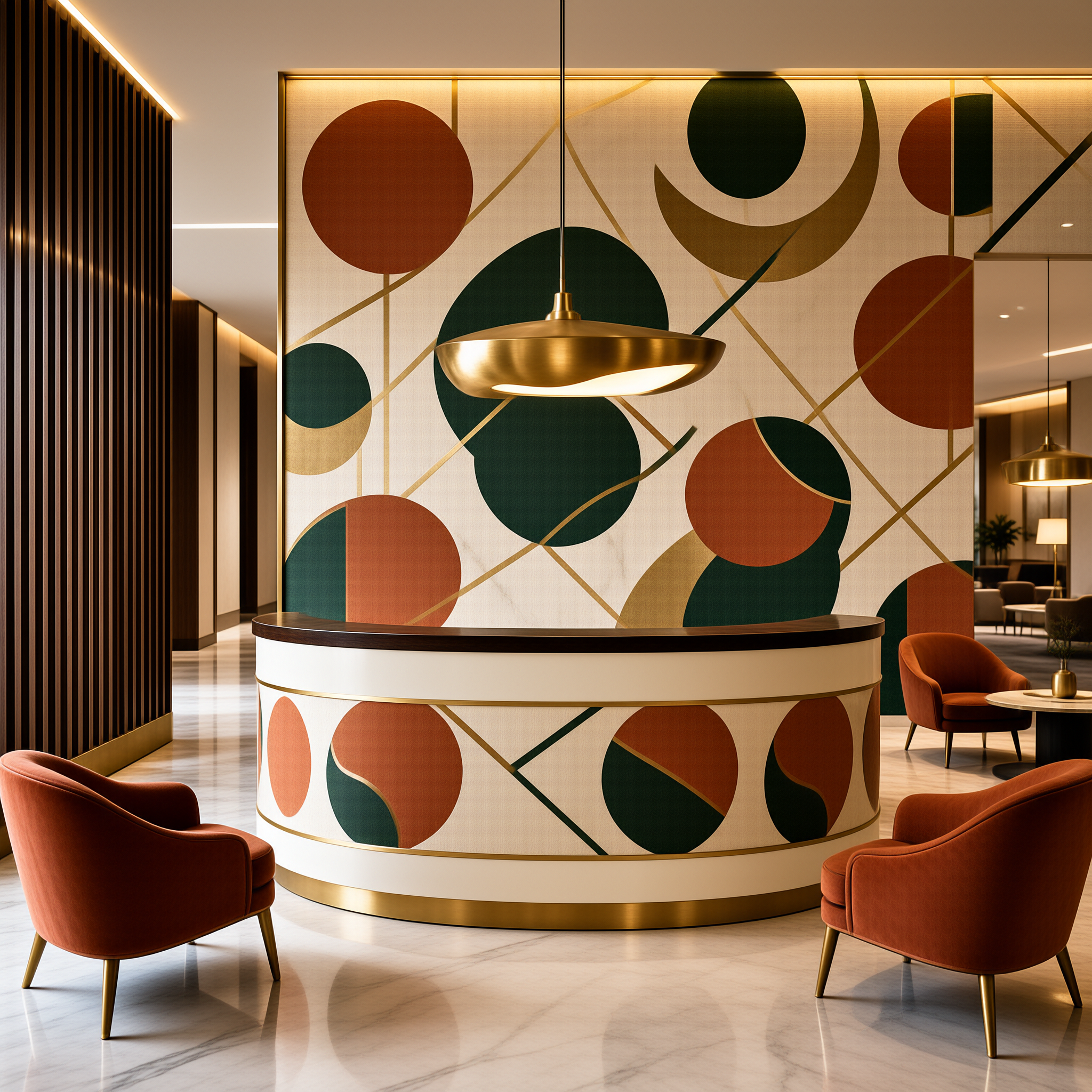
Why a Brand System Needs a Physical Surface in Commercial Interiors
Brand identity is expressed through color, pattern, typography and material. Most touchpoints split those four apart: a website shows color behind glass, a sign renders a logo in metal, a brochure prints a pattern in ink. A wall carries all four at once, at a scale people stand next to.
Interbrand describes its work across brand strategy, experience design and brand valuation, which frames identity as an experience layer rather than a document. Interiors extend that layer. Custom wallpaper for brand identity sits inside it: it takes an existing system into architecture instead of inventing a new one.
Keep the internal case calibrated. Wallcovering supports recognition through consistent visual cues and it sets the atmosphere of a room. It is not a measurable marketing lever on its own, and a supplier who promises conversion lifts from a feature wall is telling you something about their sales approach. Brand valuation is a discipline applied to a business as a whole, not to one surface inside it.
In practice, the strongest business case is portfolio consistency. A hotel group, retail chain or professional services firm with twenty reception areas gains more from one repeatable wall language than from twenty individually designed walls.
The approved physical sample is the color authority; a screen proof cannot represent a substrate.
How Do You Translate Brand Artwork Into a Wallcovering?
You start with the assets the brand team already controls, then narrow to the ones that survive enlargement. Secondary and tertiary patterns usually work harder on a wall than a logo, because they tile across long elevations. Logos, type and illustrations need their clear-space and minimum-size rules restated at architectural scale before anything goes to proof.
Adaptation is the work: a brand book is not a wall specification.
Color: From Reference Value to Physical Approval
Brand guidelines usually list color references such as Pantone, RAL or an equivalent system. Those are production targets, not production instructions. The same reference reads differently on matte paper, lightly embossed vinyl and a textured non-woven, and a change of lighting moves it again. Approve a physical sample, then keep it on file.
Pattern, Repeat and Seam Placement
Repeatable motifs travel across corners, joinery and door openings without breaking, which is why brand patterns beat standalone marks on long walls. Ask where the repeat lands relative to ceiling height and to the top of any cabinetry. Seam positions are part of the design, not a factory detail.
Pattern scale is a design decision with a practical edge. Large repeats can be cut off by short walls and window returns, while small repeats can look restless across a long sightline. Check both against the elevations, not against a single flat swatch.
Artwork Files a Manufacturer Can Use
Vector artwork where possible (EPS, AI, SVG) with fonts outlined and linked images embedded.
Raster artwork set at final print size, with resolution and color space confirmed against the manufacturer's requirements.
Named color references tied to each element, so proofing has a target to check against.
Bleed, trim and panel overlap allowances agreed before files are finalized.
One file per zone, labelled to match the elevations and the shop drawing set.
Send this pack with the brand guideline extract, not instead of it. The manufacturer needs to know which rules are fixed and which are open to adaptation, and that distinction rarely survives a verbal brief.
Matching the Wallcovering Concept to the Space
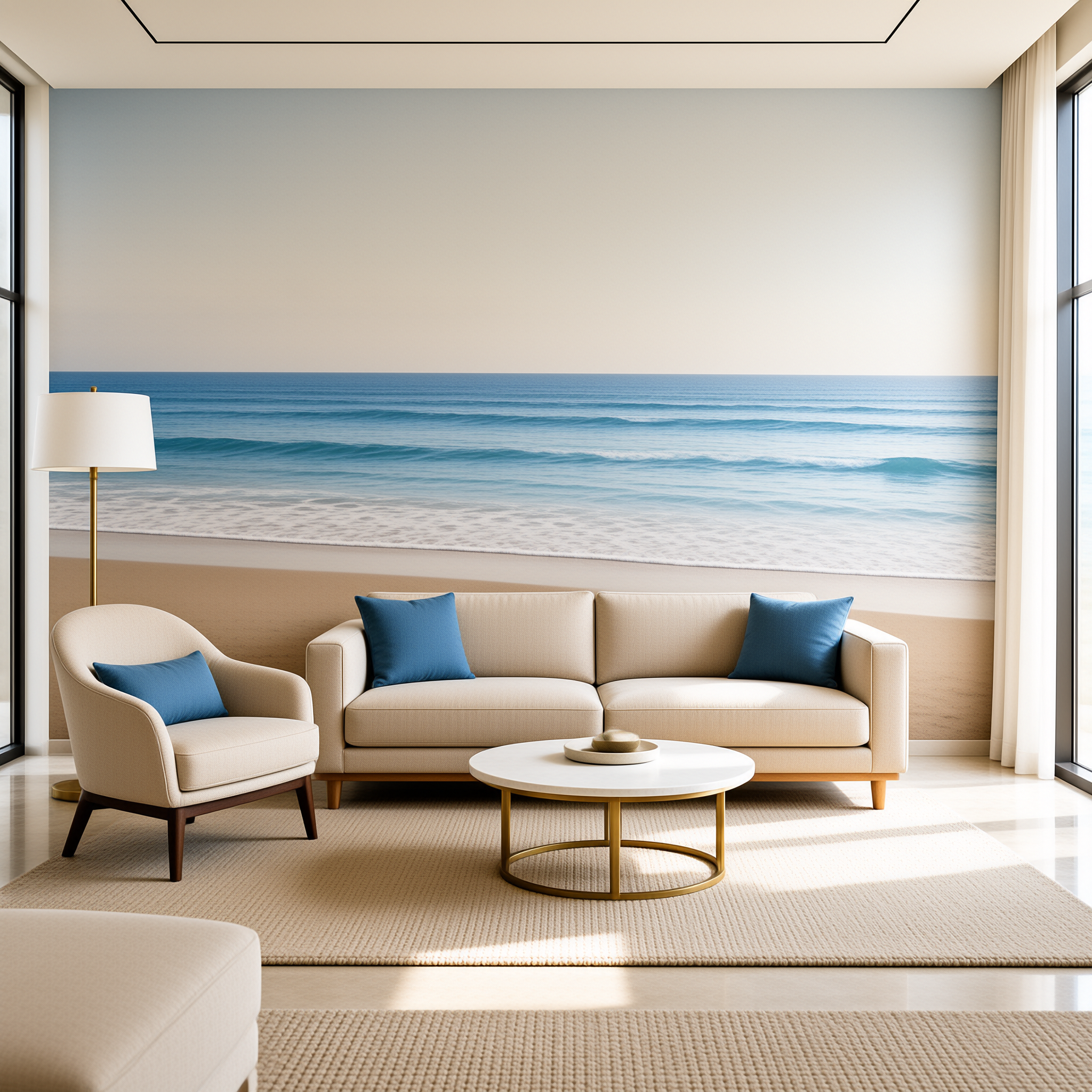
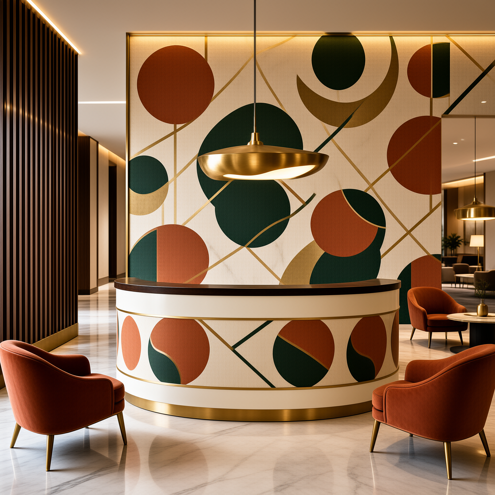
The same brand language should not arrive at the same intensity everywhere. A reception wall is read at close range and photographed constantly. A corridor is read in motion. Set intensity by zone before artwork sizes are confirmed, and the specification gets simpler for everyone downstream.
| Space type | Graphic intensity | Main constraint |
|---|---|---|
| Reception and lobby | Highest; hero feature wall | Close-range viewing, photography and joinery alignment |
| Retail | Medium; supporting | Pattern must not compete with merchandise and changing fixtures |
| Hotel public areas and corridors | Low to medium; tonal | Large repeats that read as atmosphere, plus cleaning demands |
| Workplace | Restrained and repeated | Long sightlines and consistency across multiple floors |
| Showroom | Medium; directional | Product as the focal point, wall as the backdrop |
Dezeen's interior coverage is a practical reference for how designers currently balance pattern against product, lighting and joinery in commercial schemes. Reviewing a handful of published projects before the brief is written often prevents a hero graphic that overwhelms the room.
Texture, Substrate and Finish as Part of the Brand Expression
Finish changes perceived color. A brand reference that looks correct on a matte surface can read lighter or cooler on a higher-sheen finish under the same lighting. That is why the strike-off matters, and why a lighting mock-up is worth the effort on any hero wall.
Texture also carries a brand's tactile positioning. Embossed, textile-effect and non-woven options let a heritage brand feel woven, a technical brand feel precise and a minimal brand feel quiet, all without changing the graphic system. This is where branded interior wallpaper does work that print or signage cannot.
Published project photography is the next best calibration tool, because it shows finishes under real lighting rather than studio conditions. Dezeen's project archive is a fast way to see how sheen and texture behave at architectural scale.
Substrate class should follow the project's specification requirements and the zone's cleaning and traffic expectations. Type I and Type II classifications exist for a reason, and a lobby wall does not always need the same construction as a service corridor. For zone-by-zone material reasoning in hospitality, see this guide to commercial wallcovering for hotels.
The Custom Wallpaper Workflow: Brief to Delivery
A custom commercial wallpaper project moves through six stages. Each one should end with a document that locks the decision, because the expensive failures happen when a stage is reopened after the next one has started.
Stage 1, design brief and brand artwork: collect logo files, color references, pattern assets, application zones and guideline restrictions in one pack.
Stage 2, digital proofing: review layout, scale, repeat and seam positions against elevations, with each revision numbered and signed off in writing.
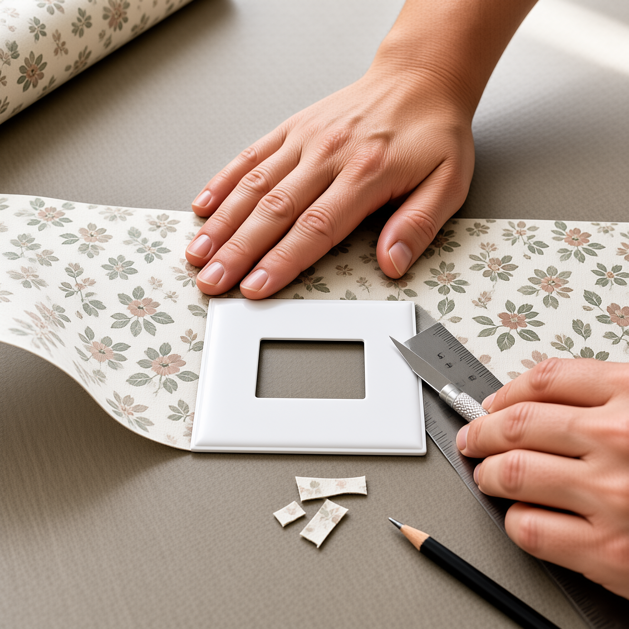
Stage 3, material sampling: approve a physical strike-off for color and texture, selected from the custom wallcovering product range.
Stage 4, size confirmation: measure the site rather than relying only on drawings, then confirm panel counts, trim allowances and how the repeat lands at corners and openings.
Stage 5, production: freeze the approved proof, sample and measurements as the single production reference before the run begins.
Stage 6, delivery and handover: sequence shipments to the fit-out programme, label rolls by zone and issue installation notes with the approved sample set.
Stage 4 is the one buyers most often compress. Drawings change during a fit-out, and a small dimension shift can move a seam or crop a motif. A site measurement visit costs a fraction of reprinting a zone.
How Do You Keep Custom Wallpaper for Brand Identity Consistent Across Sites?
Consistency comes from a small set of fixed elements: core colors, one signature motif and a consistent finish family. It does not come from identical walls everywhere. Hero treatment belongs in reception, while corridors, meeting rooms and back-of-house transitions want quieter adaptations of the same system.
Write the adaptation rules down in one place. Future sites, refurbishments and regional roll-outs can then be reproduced from the same brief instead of restarted from scratch. A custom wallcovering OEM and ODM service that retains your approved sample makes that repeatable.
Remember that the wall is one layer of an atmosphere. Lighting, joinery, flooring and acoustics all shape how a room feels, and a graphic approved in isolation can fight the rest of the scheme. Review samples against the finishes schedule and under the specified lighting.
Choosing a Custom Manufacturing Partner
Evaluate a manufacturer on how it manages brand-controlled artwork as much as on price per roll. Can it hold approved color references and a retained sample on file for repeat orders? Does it number proof revisions and return them signed? Does it measure the site, or only work from your drawings?
Ask about the handover pack as well. Zone-labelled rolls, installation notes and a retained sample set cost little at the factory and save significant time on site. For a structured comparison framework, see this guide to choosing a commercial wallcovering supplier.
Commissioning Custom Wallpaper for Brand Identity: Next Steps
Commission custom wallpaper for brand identity the way you would commission signage: with a written brief, a numbered proof, a signed physical sample and a clear freeze point before production. That discipline is what keeps a brand looking the same on the twentieth site as it did on the first.
Start by assembling the artwork pack and the zone list. Everything after that is a sequence of approvals, and each one you document early is a revision you do not pay for later. That is the whole method behind custom wallpaper for brand identity.
- Can wallpaper match an exact Pantone or RAL color?
- Manufacturers can target a reference value closely, but the substrate and finish will shift how it reads. The realistic goal is an approved physical sample that the brand team accepts as the standard for future orders.
- How long does a custom wallpaper project take from brief to delivery?
- It depends on sampling rounds, substrate choice and project size. Most of the schedule is consumed by approvals rather than printing, so build proofing and sample sign-off into the programme before fit-out dates are fixed.
- Is custom wallpaper suitable for high-traffic commercial areas?
- Often yes, but the right construction depends on the zone. Confirm traffic, cleaning regime and the project's specification requirements with the manufacturer rather than defaulting to one substrate throughout.
- Do we need to re-approve artwork for every new site?
- Not if you have documented the adaptation rules and kept the approved sample on file. New sites then need measurement and layout confirmation rather than a full design restart.
- Which files should we send first?
- Send the brand guideline extract, logo and pattern source files, color references and elevations in one pack. Vector files are preferred, with raster artwork supplied at final print size.
- Can branded interior wallpaper replace wayfinding signage?
- No. Wall graphics used in custom wallpaper for brand identity support orientation and atmosphere, but a wayfinding plan is a separate discipline. Keep the two coordinated rather than asking one surface to do both jobs.