How to specify custom wallpaper for luxury retail stores: brand-led patterns, textures, elevation artwork, strike-off approval and a supplier brief.
Custom wallpaper for luxury retail stores works best when it is run as a controlled artwork project rather than a decorative purchase.
You translate brand codes into a pattern brief, decide which walls are hero walls, scale the artwork to measured elevations, approve a physical strike-off, and then brief production wall by wall. That is the workflow this guide sets out.
The sequence matters because retail walls are photographed, lit hard and touched daily. A design that looks convincing on a screen can fail at ceiling height or under a spot beam. What follows is the order most specifiers settle into after their first rollout.
A single artwork file can be re-cropped and re-scaled across different store floor plates, which is how brands keep a recognisable look without repeating an identical installation.
Key Takeaways
Zone walls before choosing a motif: hero walls carry the pattern, quiet walls support the merchandise.
Scale is set by viewing distance and wall width, and it is reviewed on a physical sample at real distance.
Velvet-texture surfaces flatter spot-lit displays, canvas suits architectural fixtures, and smooth surfaces hold fine graphic detail.
The supplier brief needs elevations, artwork files, an approved strike-off, quantities by wall, store count and an installation date.
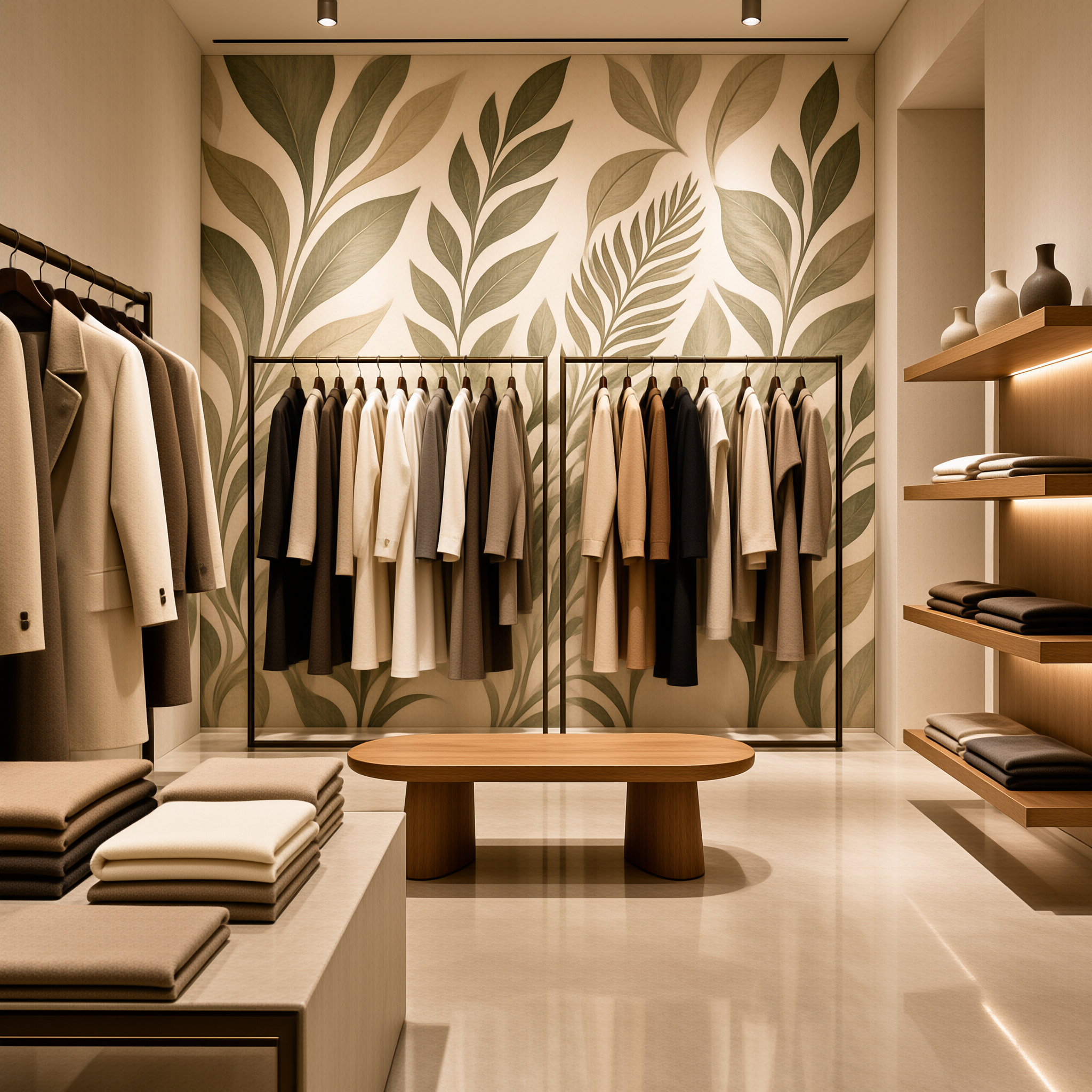
Why Brands Specify Custom Wallpaper for Luxury Retail Stores Instead of Stock
Brand codes travel cheaply on wallpaper. A palette, a motif or a graphic rhythm can carry the whole shopfront story across a thin material layer, while joinery and millwork cost far more per square metre. In most projects, this is why custom commercial wallcovering ends up doing the heavy lifting on identity. Retail coverage on Dezeen regularly treats store design as a brand experience question rather than a materials one, which reflects how much of a shop's character sits in surface and colour.
One artwork file can also serve many floor plates. When a brand opens in a city unit and then a mall unit, the artwork can be re-cropped and re-scaled rather than redesigned. That keeps the look consistent without copying one installation into a space that cannot hold it. Buyers planning three or more openings usually treat this as the main commercial argument.
Custom specification earns its keep when three things line up: enough continuous wall area, a defined brand reference, and a realistic horizon for refresh or reorder. A boutique that is mostly glass and fittings may be better served by paint and one well-made feature wall. The wallcovering product range shows what is possible across those formats.
Does Custom Wallpaper Pay Off for a Single Boutique?
Often yes. The fixed cost of a custom programme sits in artwork development and strike-off approval, and neither grows much with volume. A single store with one hero wall plus a fitting-room corridor is usually enough wall area to justify the work. A kiosk with almost no wall rarely is.
Translating Brand Identity into Pattern, Scale and Colour
Zoning comes before motif.
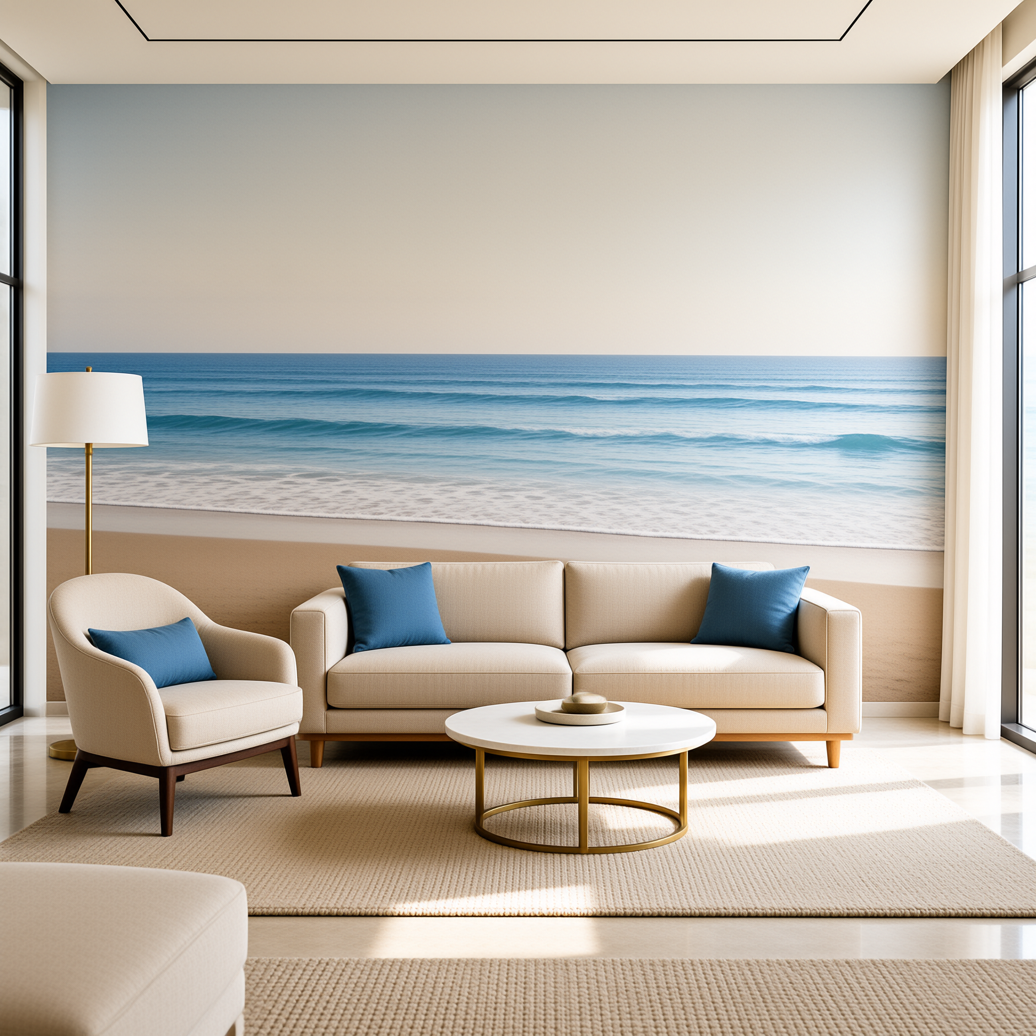
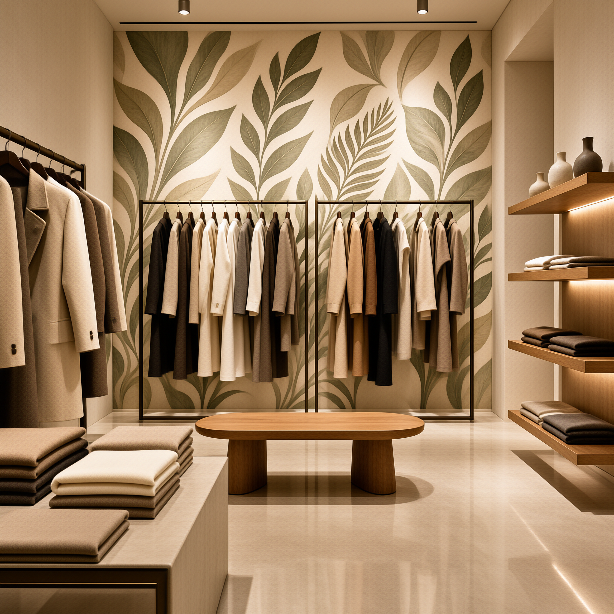
Decide which walls are hero walls, meaning product-adjacent and photographed, and which are quiet walls along circulation and fitting-room corridors. Hero walls can carry the bolder pattern and the deeper colour. Quiet walls should hold the eye without competing with the merchandise in front of them.
Scale is set by viewing distance and wall width, not by the size of a logo. A useful check is how restrained, material-led interiors read in print, and Architectural Digest remains a practical reference for that. Fine brand marks and thin typographic lines are fragile at scale, and they need a smoother surface to stay legible.
Repeat logic is a design decision, not a production afterthought. The three options behave very differently on a wall that also carries shelving, mirrors and signage.
| Repeat logic | What it reads as | Best suited to |
|---|---|---|
| Straight repeat | Order and rhythm, with a visible grid | Geometric motifs and even spacing around shelving |
| Half-drop | A softer, less mechanical grid | Organic and floral motifs on tall walls |
| Bespoke mural | Full control of where pattern falls | Hero walls that must align with fixtures and signage |
Colour should be matched to a physical reference such as a swatch, a fabric or a packaging sample, never to a screen value alone. Expect the substrate and its sheen to shift the colour slightly. Agree the tolerance in writing before production starts, so nobody is negotiating colour after the panels arrive.
Material and Texture Selection: Velvet-Texture, Canvas and Smooth Surfaces
Velvet-texture wallcovering absorbs light and adds depth. That flatters spot-lit displays, jewellery in particular, because the wall behind the product stays quiet while the product catches the beam. The trade-off is direction: pile reads differently from different angles, so review the sample under the same beam angle you will use on site.
Canvas wallcovering offers a woven hand and a more architectural feel. It pairs well with timber, stone and metal fixtures, and it tends to age gracefully in busy stores because the weave hides minor marks better than a flat surface. Print detail is slightly softer, which matters for graphic motifs.
Smooth surfaces hold fine graphic detail and crisp colour fields best. If the design is logo-derived, typographic or built from very fine line work, a smooth substrate is the safer route. The same surface shows wall defects and dents more openly, so preparation standards climb.
| Surface | Light behaviour | Where it earns its place | Watch out for |
|---|---|---|---|
| Velvet-texture | Absorbs light, deepens colour | Spot-lit displays and jewellery | Pile direction and grazing light |
| Canvas | Diffuse, woven hand | Timber and stone fixture schemes | Finer print detail is softened |
| Smooth | Even sheen, crisp reflection | Typographic and logo-derived graphics | Reveals wall defects more readily |
Specify by physical sample and hand-feel, plus the intended location. Two surfaces sold under the same descriptive term can differ in pile, weight and how they hold ink. Our guide to textured wallpaper in luxury interiors goes deeper on surface character and how finishes read in a room.
Designing to Wall Dimensions: Elevations, Repeats and Seam Planning
Start with measured elevations for every wall. Widths and heights alone are not enough. The manufacturer also needs the position of shelving, mirrors, signage, sockets, grilles and display fixtures, because artwork is planned around those interruptions. A complete elevation pack usually includes:
Wall widths and heights measured floor to ceiling
Fixture, mirror and signage positions with dimensions
Socket, switch and air grille locations
Columns, returns and ceiling height changes
Any wall partly hidden by millwork
Then decide, wall by wall, whether the artwork is scaled to the panel or scaled to the wall. A fixed composition is prepared as a finished panel that lands exactly where planned. A continuous repeat is prepared to flow across the full wall width. The two need different file preparation and different quoting.
Plan seams away from sight lines, entrances and hero views. Check finished wall height against available panel or roll width before approving a scale, because a small change can add or remove a seam. Walls that will be mostly hidden by fixtures deserve a simpler treatment. The custom wallcovering OEM and ODM service covers artwork preparation through to packed production.
Sampling and Approval: What to Review Before Production
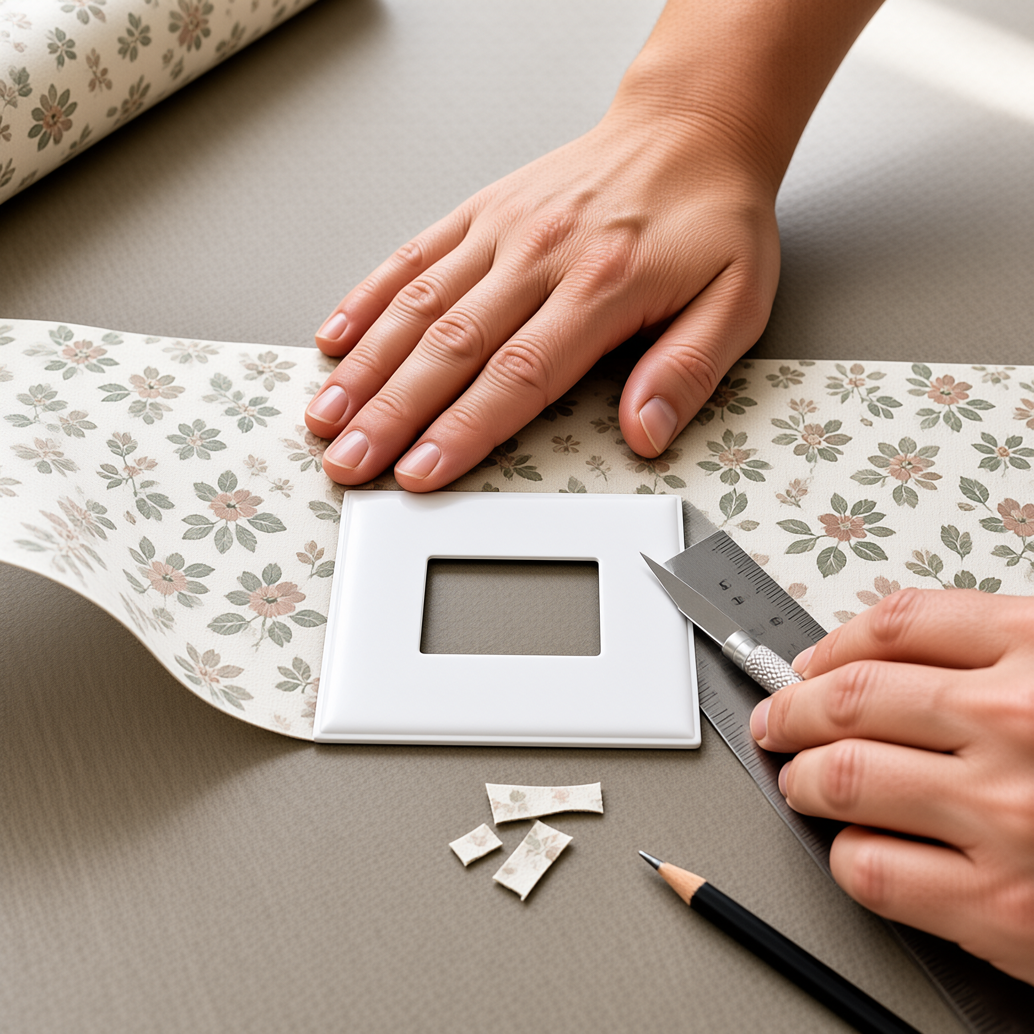
Approve on a physical strike-off, never on a screen. Review it in the store's lighting or a close simulation of it. Screen colour, paper white and surface sheen all shift the result, and none of those variables show up on a PDF.
Check the sample at real viewing distance as well as up close. Stand where the customer stands, then step back to the entrance line. Scale errors are invisible on a small swatch and become obvious on a four-metre wall.
Compare the strike-off under warm and neutral light. A colour approved in a warm-lit showroom can read cooler and flatter under neutral light, and that difference is difficult to resolve after installation. In practice, this single check prevents most colour disputes.
Retain and label the approved sample as the production reference, and agree in writing which attributes it governs: colour, texture and pattern scale. Our B2B commercial wallcovering supplier guide covers how to structure that approval conversation before a purchase order goes out.
Retail-Ready Practicalities: Wall Prep, Wear, Lighting and Fixtures
Wall preparation drives the finished result more than most specifiers expect. Fill and sand defects, check moisture and adhesion, and prime to the manufacturer's instruction. Standards published by ASTM International are a useful starting point for the documentation a project may require, but confirm the specific tests and certificates that apply to your site and location.
Sequence installation with electrical rough-in, millwork and fixture fixing. Walls that go up before the joiners arrive tend to come back damaged. Agree protection and a handover point with the main contractor early, and put it in the programme rather than in a site meeting. Lighting deserves an early review too. Colour temperature, CRI and beam angle all change how texture and colour read. Grazing light along a wall exaggerates every surface irregularity, so a fitting that flatters a display can expose a poor skim coat.
Agree a cleaning routine with the manufacturer or installer, and plan touch-up or replacement access for high-contact zones such as fitting-room corridors and till areas. Make no performance assumptions from a descriptive texture name. Ask for project-specific documentation instead.
Project-Based Manufacturing: Briefing a Custom Wallpaper Supplier
A retail brief is a project document, not a mood board. It should be complete enough that a manufacturer can quote and produce without asking you to re-explain the scheme. A working brief contains:
Wall elevations with fixture and signage positions
Artwork files and colour references per wall
The approved strike-off, labelled and referenced
Quantities per wall, per store, plus a stated waste allowance
Store count and target installation dates
Site access, delivery and storage constraints
Confirm production details in writing: panel or roll width, how repeats and seams will be handled, packing labelled by wall, and lead time measured from artwork approval rather than from enquiry. Those four points cause most of the friction in multi-store rollouts.
Multi-store rollouts need one more page. Ask how artwork will be archived, whether reorders will match the original run, and how a seasonal refresh would be handled across locations with different floor plates. Consistency at that scale is a design and production problem at once.
Getting the Brief Right First Time
Custom wallpaper for luxury retail stores is a sequence of decisions made in the right order. Brand codes set the motif, zoning sets the scale, elevations set the artwork, and the strike-off protects all three. Briefed this way, a wallcovering programme becomes repeatable across stores and seasonally refreshable without redesigning from scratch.
Start with two documents: a wall schedule with measured elevations, and one approved physical sample.
Everything else in the supplier brief follows from those.
- Is custom wallpaper suitable for a high-traffic fashion store?
- It can be, provided the substrate is chosen for the location and the walls are prepared properly. Discuss expected traffic with the manufacturer and ask what documentation they can supply for your project.
- Should I specify velvet-texture or canvas wallcovering?
- Velvet-texture suits spot-lit displays and jewellery because it absorbs light. Canvas suits timber and stone fixture schemes with a more architectural feel. Decide on a physical sample under your store lighting.
- Can one design work across stores with different layouts?
- Yes, if the artwork is built for re-scaling rather than fixed to one wall. Ask the manufacturer to prepare panel and wall-scaled versions of the same file.
- What files does a manufacturer need to quote a retail project?
- Measured elevations, artwork files and colour references per wall, quantities by wall, store count and target installation dates. A labelled approved sample should follow before production.
- How do I approve colour before production?
- Approve on a physical strike-off viewed at real distance, under both warm and neutral light. Keep the approved piece labelled as the production reference.
- How early should lighting be reviewed?
- Before the artwork is finalised. For custom wallpaper for luxury retail stores, colour temperature, CRI and beam angle change how texture and colour read, and grazing light will expose any wall irregularity.